Design System · Higher X Co., Ltd
HDS WEB — Building a Design System
for Consistent UX Delivery

About the Product
What is WKDK?
WKDK (Wokie Dokie) is a Korean mobile app for store management, focused on part-time staff management for restaurants, cafés, convenience stores, retail shops, and franchise businesses.

Task & Checklist
Daily tasks with photo verification.

Shift & Schedule
Organize shifts and coordinate handovers.

Recruitment
Hire workers and onboard via system flow.

Internal Communication
Announcements and chat for store workers.
Outcome
−40%
20-page sprint: 10 days → 6. Design output delivered in 40% less time.
19
4 brand foundations + 14 UI components, each with 3 doc types — shipped as a complete handoff kit.
Bi-weekly
Meeting cadence down 83% after adoption — from 3× a week to bi-weekly, reclaiming working hours.
A structured token-based design system that aligned design and development on a single source of truth — reducing redundant work, eliminating verbal-only handoff, and laying the foundation for scalable product growth.
Context
WKDK (Wokie Dokie) is a store management mobile and web app used by frontline workers across restaurants, retail, and franchise businesses. The app had been built with a design system and iterated up to version 2.0 — but significant gaps between design intent and shipped code had accumulated over time.
The engineering team was mid-migration from Vue to React — a large-scale code transition that created a clean window to establish a proper design system from the ground up. With the B2B expansion underway and ADT Cap. as a target client, consistency and handoff quality were no longer optional.
Sole designer responsible for architecting the entire system — from token structure and documentation to component design and developer sync. Worked directly with 2 front-end developers to align Figma properties with code properties throughout.

The Problem
Design and development were out of sync
- Some elements weren't systematized — gaps existed between design files and actual shipped interfaces
- Screen maintenance and updates were difficult to manage consistently
- No clear source of truth for design decisions
The system existed only as verbal agreement
- Component concepts were communicated verbally — no written documentation
- Different team members had different understandings of the system
- Old system versions and new patterns were mixed in production
- Led to UX degradation and functional errors
Design Tokens — The Foundation
Before building a single component, we established the token layer — a structured hierarchy of design variables that serves as the single source of truth for every colour, spacing, and typography decision in the product. Inspired by Salesforce's Design Token methodology, we defined tokens across three layers.
The source of all styles and the foundation of system tokens. Every value needed to build a screen begins here.
*Not used directly in design — connection layer only.
Tokens that express the product's states (status, feedback, brand). Must always be derived from ref tokens. Assignments follow visual hierarchy and accessibility principles.
Token values used when building specific components. Derived from system tokens — a component token is only ever used within the component it belongs to.
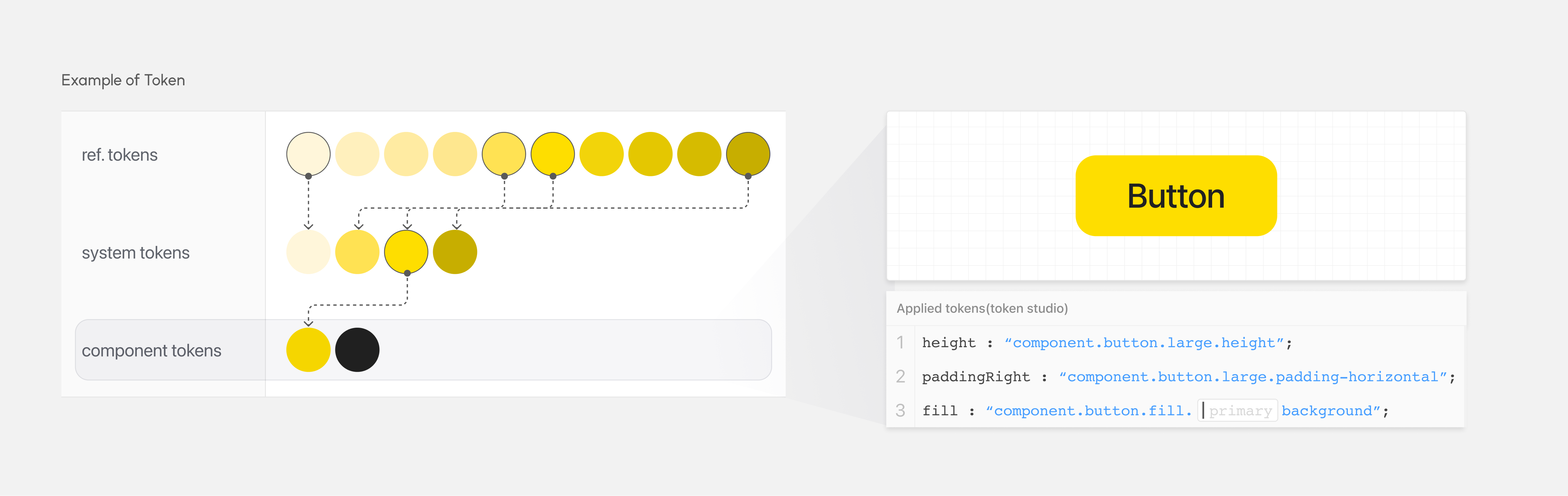
Because all style sources trace back to ref tokens, updating a single token value cascades automatically through every component that references it — eliminating the manual, error-prone "find and replace" work that had been causing design-dev divergence.
We introduced the Tokens for Figma plugin to manage this token structure within Figma itself. This enabled the design token values to be shared and referenced consistently across all design files — creating a live connection between the token definitions and the components built on top of them.
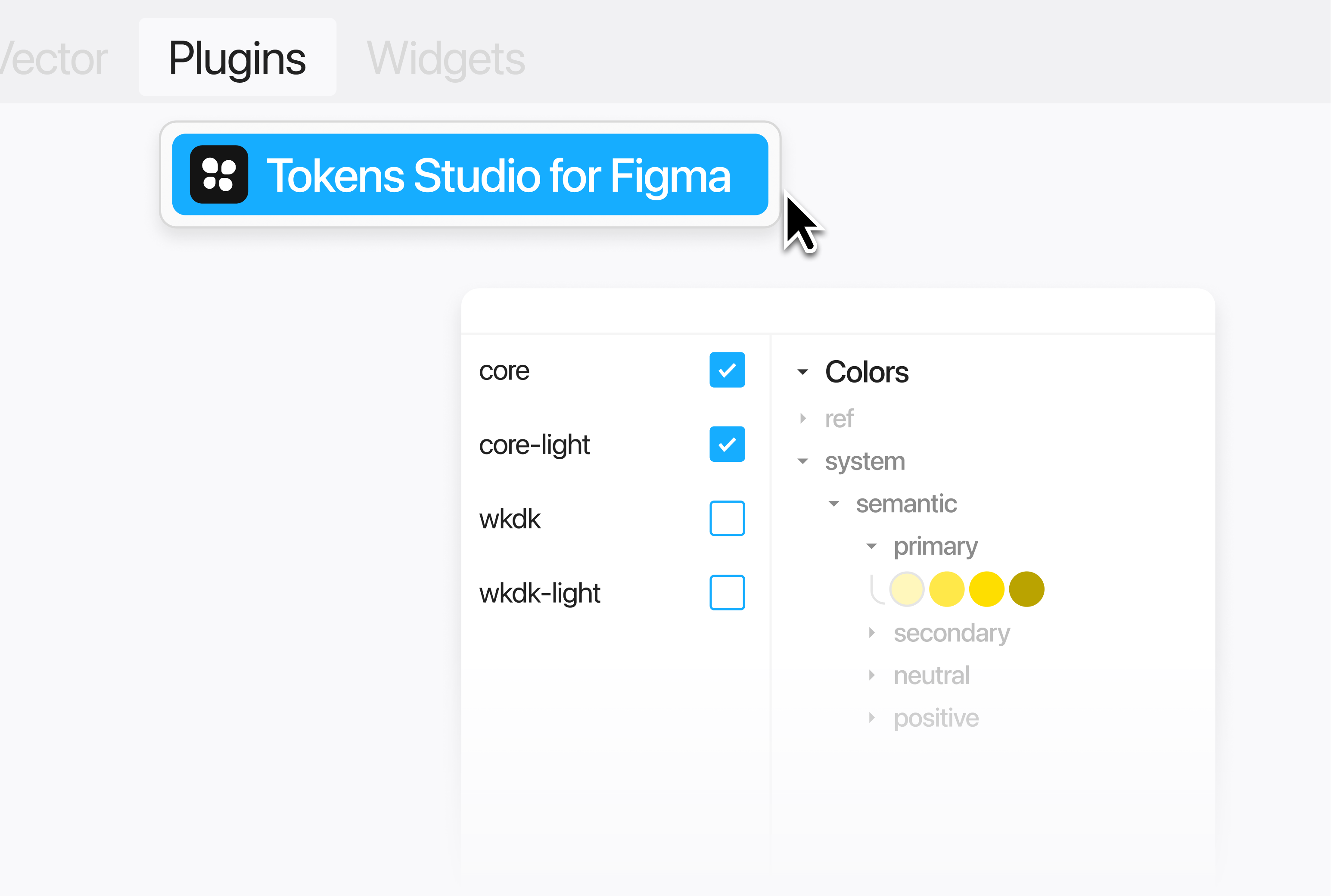
System Documentation
The previous system had lived entirely in team members' heads. To fix that, every element of HDS WEB was documented so that any team member — designer or developer — could understand the system's structure without needing to ask someone else.
Figma component properties were deliberately matched to their code counterparts. Every Auto Layout structure in Figma maps directly to a Flexbox implementation in code. This eliminated translation ambiguity at handoff — developers could read Figma properties as if they were reading code.
4
Foundation Types
Color, Typography, Spacing, and Grid — each with full token mapping and usage rules documented.
14
UI Components
Each component documented in 3 formats: Basic (anatomy), Usage (when and how to use), Component (variants and properties).
3
Doc Types per Component
Basic · Usage · Component — ensuring both designers and developers could reference what they needed without cross-referencing.
1
Source of Truth
Single Figma file, shared across the entire product team. No more versioning confusion or "which file is latest?"

In the Product
HDS WEB was applied across the full WKDK mobile product interface — every screen, every component, every interaction. The modular structure meant that building new screens became assembly work rather than creation from scratch. Each screen references the same tokens and component set.


Result & Reflection
40% reduction in design work resources
The modular component structure meant that building 20 screens dropped from 10 days to 6. Teams no longer re-solved the same design problems across different screens — they assembled from a shared library with clear rules.
20 screens · design time
Meetings reduced from 3× a week to bi-weekly
Before the system, recurring alignment meetings ran 3 times per week — re-confirming component usage, re-explaining intent, re-clarifying decisions. After adoption, sync cadence dropped to bi-weekly check-ins. The documentation did the work the meetings used to do.
3×
per week (before)
Concept re-confirming,
component clarification
Bi-weekly
after system adoption
Light async check-ins,
component additions only
The biggest shift was moving the team from "what should this look like?" to "which component fits here?" — and that change only happened because the documentation made the rules explicit and accessible to everyone. A design system without documentation is just a Figma file. The work that made this one useful was the writing, not the design.
If I were to do it again, I'd invest more in the system's governance model earlier — defining how new components get proposed, reviewed, and added, rather than leaving it as an informal process.